@Limitee 头像是皮卡丘,所以结合了宝可梦画风
pocket-spark.stellafortuna.dpdns.org
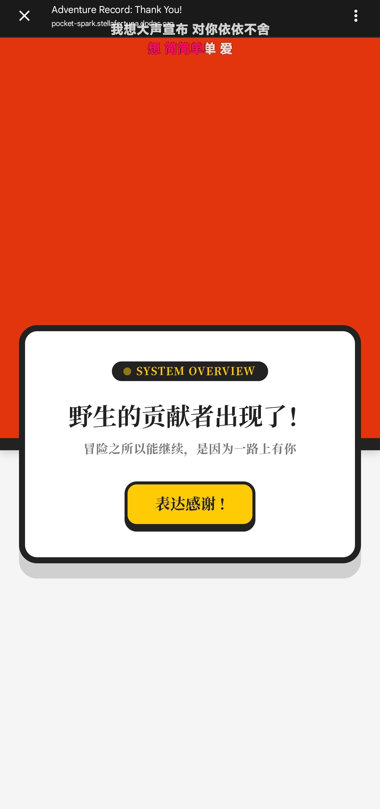
网站名字是:pocket-spark
[!quote]
口袋里的金色火花w 象征着那个默默给予我们支持、在需要时为我们充能的温暖存在~

还带音效~
只因为他很可爱,且有问必回
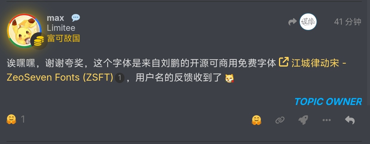
用的正是那个开源字体
可以这样用:
body { font-family: "JiangChengLvDongSong"; font-weight: normal; } 加载完了才会渲染,非常贴心~源码:
<!DOCTYPE html>
<html lang="zh-CN">
<head>
    <meta charset="UTF-8">
    <meta name="viewport" content="width=device-width, initial-scale=1.0">
    <title>Adventure Record: Thank You!</title>
    <!-- 引入超级超级好看的江城律动宋字体~ -->
    <link href="https://fontsapi.zeoseven.com/147/main/result.css" onload="this.rel='stylesheet'" rel="preload" as="style" crossorigin />
    <noscript><link rel="stylesheet" href="https://fontsapi.zeoseven.com/147/main/result.css" /></noscript>

    <style>
        * {
            box-sizing: border-box;
            margin: 0;
            padding: 0;
        }

        body {
            font-family: "JiangChengLvDongSong", sans-serif;
            font-weight: normal;
            min-height: 100vh;
            display: flex;
            justify-content: center;
            align-items: center;
            /* 经典精灵球红白背景分割 */
            background: linear-gradient(to bottom, #E3350D 50%, #F5F5F5 50%);
            position: relative;
            overflow: hidden;
        }

        /* 精灵球中间的黑色分割线 */
        body::before {
            content: '';
            position: absolute;
            width: 100%;
            height: 16px;
            background-color: #222222;
            top: 50%;
            transform: translateY(-50%);
            z-index: 1;
            box-shadow: 0 4px 10px rgba(0,0,0,0.15);
        }

        /* 主体卡片:悬浮在精灵球中央的按钮装置 */
        .card-container {
            position: relative;
            z-index: 10;
            background: #FFFFFF;
            border: 8px solid #222222;
            border-radius: 24px;
            width: 90%;
            max-width: 480px;
            padding: 40px 30px;
            box-shadow: 0 20px 0px rgba(0, 0, 0, 0.15);
            text-align: center;
            transition: all 0.3s cubic-bezier(0.175, 0.885, 0.32, 1.275);
        }

        /* 顶部装饰:致敬血条/等级框 */
        .badge-header {
            display: inline-flex;
            align-items: center;
            gap: 8px;
            background: #222222;
            color: #FFCB05; /* 电气黄 */
            padding: 6px 16px;
            border-radius: 30px;
            font-size: 14px;
            letter-spacing: 1px;
            margin-bottom: 24px;
        }

        .badge-dot {
            width: 8px;
            height: 8px;
            background-color: #FFCB05;
            border-radius: 50%;
            animation: pulse 1.5s infinite;
        }

        /* 文本展示区 */
        .content-box {
            margin-bottom: 35px;
        }

        .main-title {
            font-size: 32px;
            color: #222222;
            line-height: 1.4;
            margin-bottom: 12px;
        }

        .sub-title {
            font-size: 16px;
            color: #777777;
            letter-spacing: 0.5px;
        }

        /* 交互按钮 */
        .action-btn {
            background-color: #FFCB05;
            color: #222222;
            border: 4px solid #222222;
            border-radius: 16px;
            padding: 16px 36px;
            font-size: 20px;
            font-family: "JiangChengLvDongSong", sans-serif;
            cursor: pointer;
            outline: none;
            position: relative;
            overflow: hidden;
            box-shadow: 0 6px 0 #222222;
            transition: all 0.1s ease;
        }

        .action-btn:hover {
            background-color: #FFE054;
            transform: translateY(-2px);
            box-shadow: 0 8px 0 #222222;
        }

        .action-btn:active {
            transform: translateY(4px);
            box-shadow: 0 2px 0 #222222;
        }

        /* 触发感谢后的彩蛋状态 */
        .card-container.unlocked {
            border-color: #FFCB05;
            box-shadow: 0 20px 0px rgba(255, 203, 5, 0.2);
        }

        .card-container.unlocked .badge-header {
            background: #FFCB05;
            color: #222222;
        }

        .card-container.unlocked .badge-dot {
            background-color: #E3350D;
        }

        /* 粒子礼花 */
        .particle {
            position: absolute;
            pointer-events: none;
            width: 12px;
            height: 12px;
            background: #FFCB05;
            border-radius: 50%;
            z-index: 100;
            animation: popOut 0.8s ease-out forwards;
        }

        @keyframes pulse {
            0% { transform: scale(1); opacity: 1; }
            50% { transform: scale(1.3); opacity: 0.5; }
            100% { transform: scale(1); opacity: 1; }
        }

        @keyframes popOut {
            0% {
                transform: translate(0, 0) scale(1);
                opacity: 1;
            }
            100% {
                transform: translate(var(--tx), var(--ty)) scale(0);
                opacity: 0;
            }
        }
    </style>
</head>
<body>

    <div class="card-container" id="card">
        <div class="badge-header">
            <span class="badge-dot"></span>
            <span>SYSTEM OVERVIEW</span>
        </div>

        <div class="content-box">
            <h1 class="main-title" id="title">野生的贡献者出现了!</h1>
            <p class="sub-title" id="subtitle">冒险之所以能继续,是因为一路上有你</p>
        </div>

        <button class="action-btn" id="btn" onclick="triggerGratitude()">
            表达感谢 !
        </button>
    </div>

    <script>
        let hasTriggered = false;

        function triggerGratitude() {
            if (hasTriggered) return;
            hasTriggered = true;

            const card = document.getElementById('card');
            const title = document.getElementById('title');
            const subtitle = document.getElementById('subtitle');
            const btn = document.getElementById('btn');

            // 切换为解锁/感谢状态
            card.classList.add('unlocked');
            title.innerHTML = "使用了「 谢谢你 」!";
            subtitle.innerHTML = "效果超群!你的付出我们都收到了喵~";
            btn.innerHTML = "MISSION ACCOMPLISHED";
            btn.style.backgroundColor = "#EEEEEE";
            btn.style.color = "#888888";
            btn.style.cursor = "default";
            btn.style.transform = "none";
            btn.style.boxShadow = "none";
            btn.style.borderColor = "#CCCCCC";

            // 播放经典宝可梦中心恢复生命值的 8-bit 音效
            playPokemonHealSound();

            // 喷射黄色小礼花
            const rect = btn.getBoundingClientRect();
            const startX = rect.left + rect.width / 2;
            const startY = rect.top + rect.height / 2;

            for (let i = 0; i < 40; i++) {
                createParticle(startX, startY);
            }
        }

        // Web Audio API 合成 8-bit 经典音效 (C5 -> D5 -> E5 -> F5 -> G5 -> A5...)
        function playPokemonHealSound() {
            const AudioContext = window.AudioContext || window.webkitAudioContext;
            if (!AudioContext) return;

            const ctx = new AudioContext();
            const now = ctx.currentTime;

            // 经典宝可梦中心恢复旋律的音高
            const notes = [
                392.00, // G4
                440.00, // A4
                493.88, // B4
                523.25, // C5
                587.33, // D5
                659.25  // E5
            ];

            notes.forEach((freq, index) => {
                const osc = ctx.createOscillator();
                const gainNode = ctx.createGain();

                // 经典的方波模拟 8-bit 复古感
                osc.type = 'square';
                osc.frequency.setValueAtTime(freq, now + index * 0.12);

                gainNode.gain.setValueAtTime(0.08, now + index * 0.12);
                gainNode.gain.exponentialRampToValueAtTime(0.01, now + index * 0.12 + 0.15);

                osc.connect(gainNode);
                gainNode.connect(ctx.destination);

                osc.start(now + index * 0.12);
                osc.stop(now + index * 0.12 + 0.18);
            });
        }

        // 纯 CSS 粒子礼花效果
        function createParticle(x, y) {
            const p = document.createElement('div');
            p.classList.add('particle');

            // 随机颜色(电气黄、红、白)
            const colors = ['#FFCB05', '#E3350D', '#FFFFFF', '#222222'];
            p.style.backgroundColor = colors[Math.floor(Math.random() * colors.length)];

            // 随机大小
            const size = Math.random() * 8 + 6;
            p.style.width = `${size}px`;
            p.style.height = `${size}px`;

            // 随机星形或圆形
            if (Math.random() > 0.5) {
                p.style.borderRadius = '0px'; // 像素风小方块
            }

            p.style.left = `${x}px`;
            p.style.top = `${y}px`;

            // 随机散射方向和距离
            const angle = Math.random() * Math.PI * 2;
            const distance = Math.random() * 180 + 80;
            const tx = Math.cos(angle) * distance;
            const ty = Math.sin(angle) * distance - 50; // 稍微向上飘一点

            p.style.setProperty('--tx', `${tx}px`);
            p.style.setProperty('--ty', `${ty}px`);

            document.body.appendChild(p);

            // 动画结束后移除
            setTimeout(() => {
                p.remove();
            }, 800);
        }
    </script>
</body>
</html>
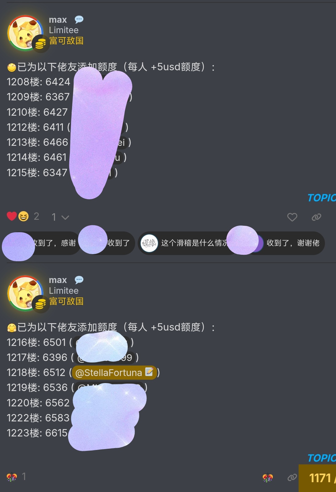
2 个帖子 - 2 位参与者
来源: LinuxDo 最新话题查看原文